Content Therapy Case Study
Introduction
In 2003, I took a “scrapbooking” class. Scrapbooking involves putting photos onto pages in a themed book with embellishments and commentary. Creating these memory artifacts was enjoyable, and the books I produced are cherished by the people I made them for.
This experience stuck with me because in 2018 I find myself questioning popular “memory keeping” practices. Where we should be memory keeping, we are instead “posting” “sharing” and “engaging” with social networks and digital platforms that are not designed for healthy memory keeping.
Questioning the tools we use
to create and share memories.
What is memory (keeping) ?
Common answers about the importance of memory keeping were that it enables us to learn, craft identity, and connect with others. There was uncertainty about the value of the tools and artifacts respondents use to augment their memories. I believe this is because the tools we use to augment our brain’s memory are not designed as memory keeping tools. They are designed foremost to stimulate engagement with the tool itself or the network it is built upon. For something as important as memory keeping, it is surprising that we rig together a set of social networks, cloud storage, messaging apps, and media production tools
To learn about the idea of memory keeping, I interviewed five people with questions like “How do you keep memories?” and “What is the most valuable type of memory?”. There is an intergenerational aspect to memory keeping, so I asked questions like “does anyone have a responsibility to preserve your legacy?” and “what are reasons people do not speak more with elders?”.
Interview Quotes
“I take them for granted but I need to know they are there. I don’t often access them but knowing where to find them makes me feel secure.”
“You kind of can’t know where you are going unless you know where you have been and why.”
“If they are just for yourself then you are just hoarding. Or it’s another way of expressing attachment. I guess some people might describe that as cherishing, but that’s not how i look at it.”
User
Interviews
“It’s weird because we have no idea how valuable a memory is when the instance is occurring but over time how you experience the memory shapes what it is.”
“Elders have this... they want to pass things along. When you are with your peers you are just having a conversation, where elders are always trying to teach back. I would be less likely to push back on that because they just want to share their life stories and lessons so if you push back what you are telling them is what they experienced isn’t valid versus I don’t agree with your opinion.”
User Journey Mapping
MEMORY
I used these takeaways to create a user journey map that starts with expecting a memorable experience and moves through creating memory artifacts, retrieving them, and dealing with the memory artifacts once the primary memory keeper has passed away.

Competitive Teardown
Next, I examined the tools people use on the journey. I found the tools contained the right features, but they were in the wrong place, used awkward copy, were insensitive, and at times produced embarrassing results. An example of this is Facebook’s “DELETE AFTER DEATH” button. A common feature was the ability to auto-generate a “scrapbook” with user’s content. This often took the form of a slideshow, but it only took a small mistake for the magic to disappear. For example, a slideshow produced by my iphone photos app was enjoyable until it began showing text heavy screenshots I captured for work. This showed me people want to automate the production of digital “scrapbooks” that augment memory keeping, but they need to be able to command change in whatever is produced.
Facebook’s “Delete After Death” button.


Facebook’s Awkward Memories Section. Diggy Simmons fell off, and “happy to be at party person” is my ex.
Flowchart
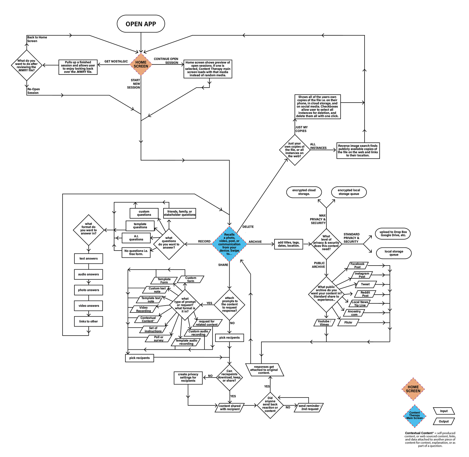
At this point I had an understanding of user’s sentiment about memory keeping and the digital tools that augment it. I used this understanding to create a new task flow for addressing the photos and videos users created on their phone. The task flow allows users to address and react to their content without the bias present when posting online. My expectation was this would empower users to act on their content faster, more often, and more authentically. The benefits would be a decluttered phone, and more valuable interactions with digital content.

Sketches
I had a vision of how the main screen should look that was based on Tinder. This was because Tinder takes something we expect to be time consuming (finding matches), and puts it in an interface where users are comfortable speeding up the process. To avoid being stuck in a local maximum, I forced myself to sketch the same screens in many versions. This was helpful when producing wireframes because I had a variety of features and styles to pull from.

Button Style Wireframes

Add Notes Interface and Interactions
While a primary function of Content Therapy is to declutter and organize, once kept, a piece of media becomes a living growing relic.
The add notes interface facilitates comments, interactions and additional memory making around the media, in a a format that does not get “posted” anywhere but instead lives with the media file itself
Swipe style wirframes
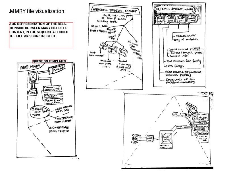
The “Memory File” (.MMRY)
Interactions around a piece of media are saved as a .MMRY file (“Memory File).
The contents of these files are represented in Content Therapy as a navigable 3D space that temporally archives the interactions while also facilitating nostalgia fueled exploration.
Wireframes + Prototype #1
I created two wireframe styles of the app. One used swiping, the other used button pushing to complete tasks. After receiving critiques on the wireframe, I learned users preferred buttons. Additionally, I learned the features and information on some screens caused cognitive overload. With this in mind, I used the button style to produce an Invision prototype. Because the prototype would not draw real content from a users phone, I created it to answer the questions:
Does the design communicate app purpose and functionality?
Do people find value in this type of app?


Usability Testing
I gathered three subjects for usability testing. I asked them about their initial impression off the app and its functionality. I observed them using the app while they shared their thoughts out loud. It became clear the initial screen did not communicate the value of the app. I wanted users to know they could declutter their phone and have more authentic interactions with their content, but the only way they could learn this was by navigating through all the screens. This was unrealistic to expect people to explore the entire app before forming expectations and making value judgments.
Prototype #2
I incorporated insights from critiques and usability testing to create a second prototype. The biggest change was creating a home screen that was different from the screen that surfaces content. This is where I could communicate the app’s value. In some places where the task flow did not match user expectations, I did not make changes. The initial cognitive dissonance is worth causing in order to communicate the app’s approach to creating joy from digital content. For example, when users clicked “SHARE” they expected to post the file to social media. In the Content Therapy app “SHARE” only enables you to share privately and directly with people.
Sketches for Prototype #2 - Home Page and Get Nostalgic Page
Wireframes for Prototype #2 Home Page and Get Nostalgic Page

